
The visual system behind Watt — colors, typography, marks, patterns, and the rules that hold it all together.
Our palette is built on a single signature color — electric lime — held in balance by a foundation of warm, refined neutrals. Lime earns attention. Neutrals do the work.
Scale does the work of weight. Regular 400 carries the display tier. Medium 500 structures headings and UI. Semibold 600 is reserved — used rarely, deliberately.
The mark carries the system. Lime on dark is canonical. Dark on lime is the inverse. Taupe on warm surfaces is the editorial voice. Nothing else.
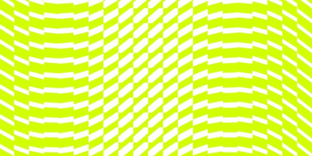
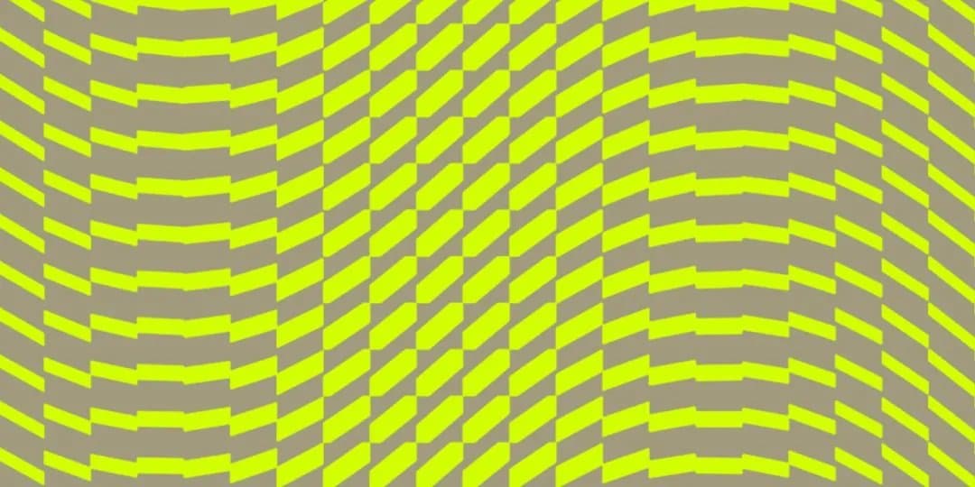
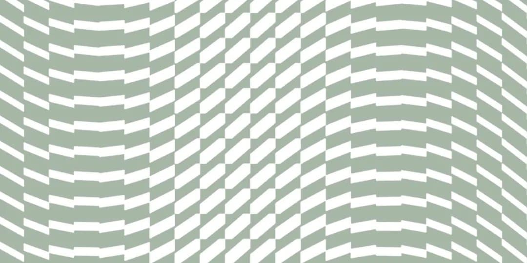
A repeating chevron wave — warm, technical, ownable. It flexes across surfaces as background, section break, or full-bleed moment. Two-tone always, same-temperature always.


Transmission towers. Power lines. The literal infrastructure for literal electricity — reframed as the infrastructure for AI. No humans in brand photography. No AI-generated imagery. Ever.
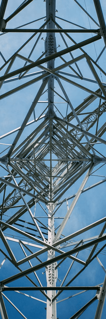
Sharp, low-angle. Blue-sky negative space. Reads modern, confident, forward-looking.
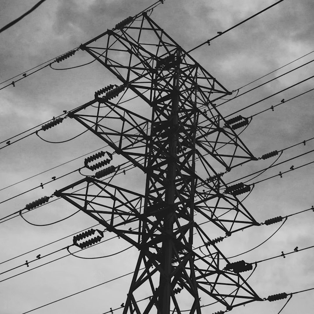
Overcast sky, silhouetted towers. Reads editorial, serious, weighty. Longform and thought leadership.
Every chart is black plus lime. Watt is always the lime one. Surface picks the mood. Type carries the chart.
Buttons, cards, inputs, navigation. Flat, zero radius, deliberate.
Three principles. A lil combative, but generous — speak like someone who picked a fight on purpose and is winning it. Confident and daring — like a coach who believes in the team and demands they play to win. Direct and zero pretense — never afraid to say the quiet part out loud.